
Promotional Cards Project
2018
Knee Pads
Come to Knee Pads! We are volleyball's number 1 best friend. These promotional cards are designed to promote a volleyball club called Knee Pads. The club is named after a protective gear that is crucial for volleyball players. This gives the idea that safety and health is the club's number one priority. The logo can only consist of the glyphs of one typeface, Futura, and I used round brackets to capture the shape of a knee pad. The back cover of the card consists of "action" words that illustrate the physical activities of volleyball, such as "bump, set, spike" where the word "spike" aims to imitate the sharp angle of a spike.
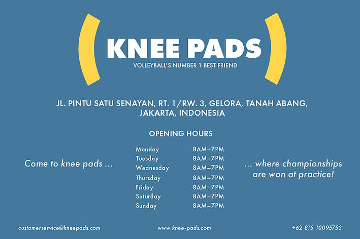
The blue, yellow, and white colors are inspired by the colors of a Mikasa ball that was used in the Olympic volleyball.


