top of page
The assignment for the Branding class was to rebrand a company that closed its doors at least 10 years ago. Karissa chose an independent bookstore called Kroch’s & Brentano’s — Chicago’s nirvana for book lovers.
Kroch's & Brentano's


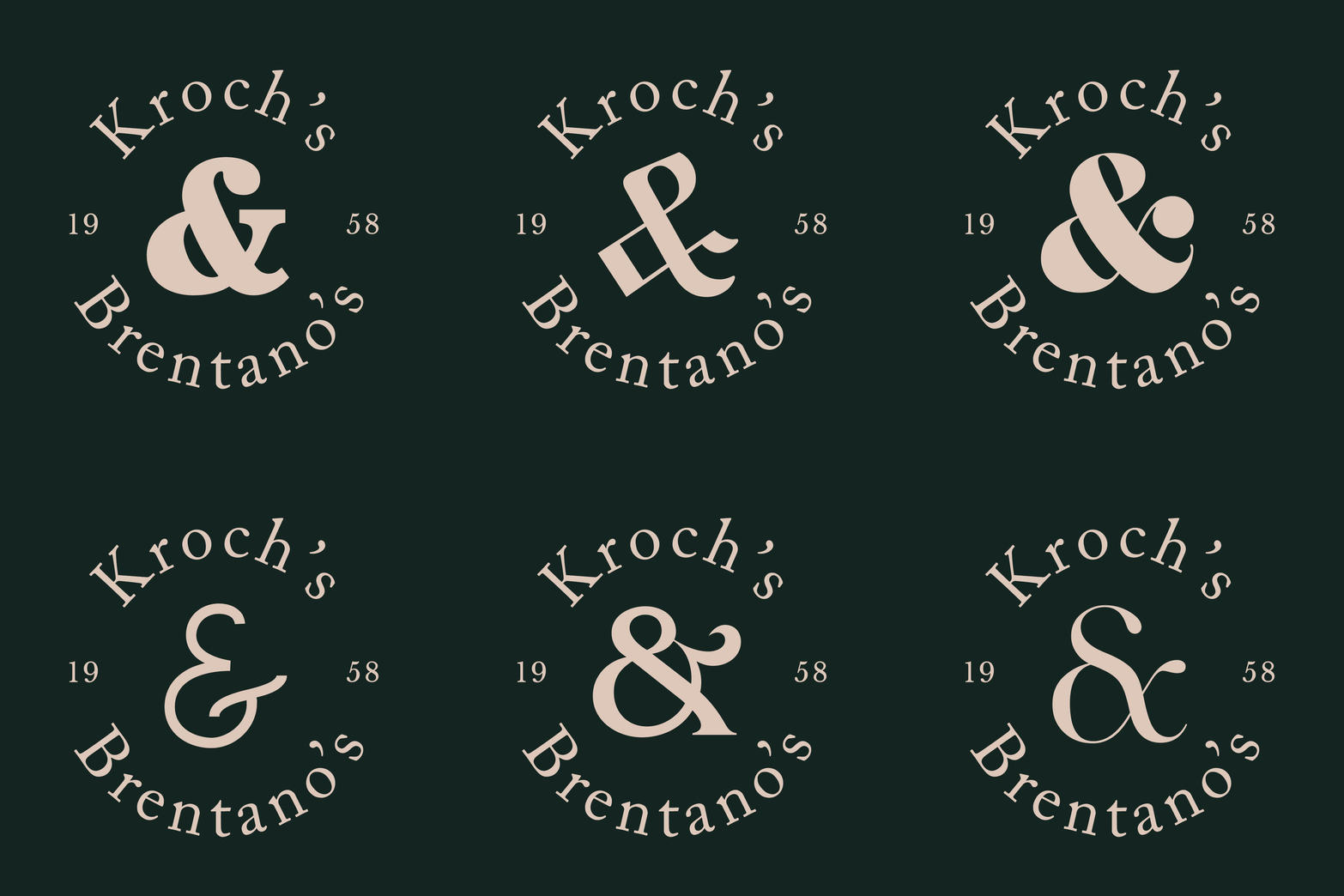
The logo is flexible.
Each ampersand is unique, just like every genre of book. There is a genre for every type of reader. Their uniqueness also visualizes Kroch's & Brentano's specialized connections with their customers. Books can be personal, so it’s important to develop close relationships with their customers to know what kinds of books they like.
Primary Typeface

Secondary Typeface


The colors are all inspired by the colors you see in a bookstore. From the emerald carpet to the brown wooden bookcases and off-white grained book paper. The brand identity should embody the full experience of being in a bookstore, even if it’s just by looking at the colors.

"Since you've seen..." Ad Campaigns
The ad campaign is not about advertising the books, instead, it is
about celebrating the booksellers' skills and abilities to give good book recommendations. Most people are more familiar with pop culture films, so by recommending books similar to the films they watch will hopefully get them to read and come to Kroch's & Brentano's for more.
bottom of page


